
CLIENT
Southern Cross University
MY ROLE
Creative Concept and Design
AGENCY
Blaze Advertising (WPP)
AWARDS
Graphis Branding Awards: Silver
Overview
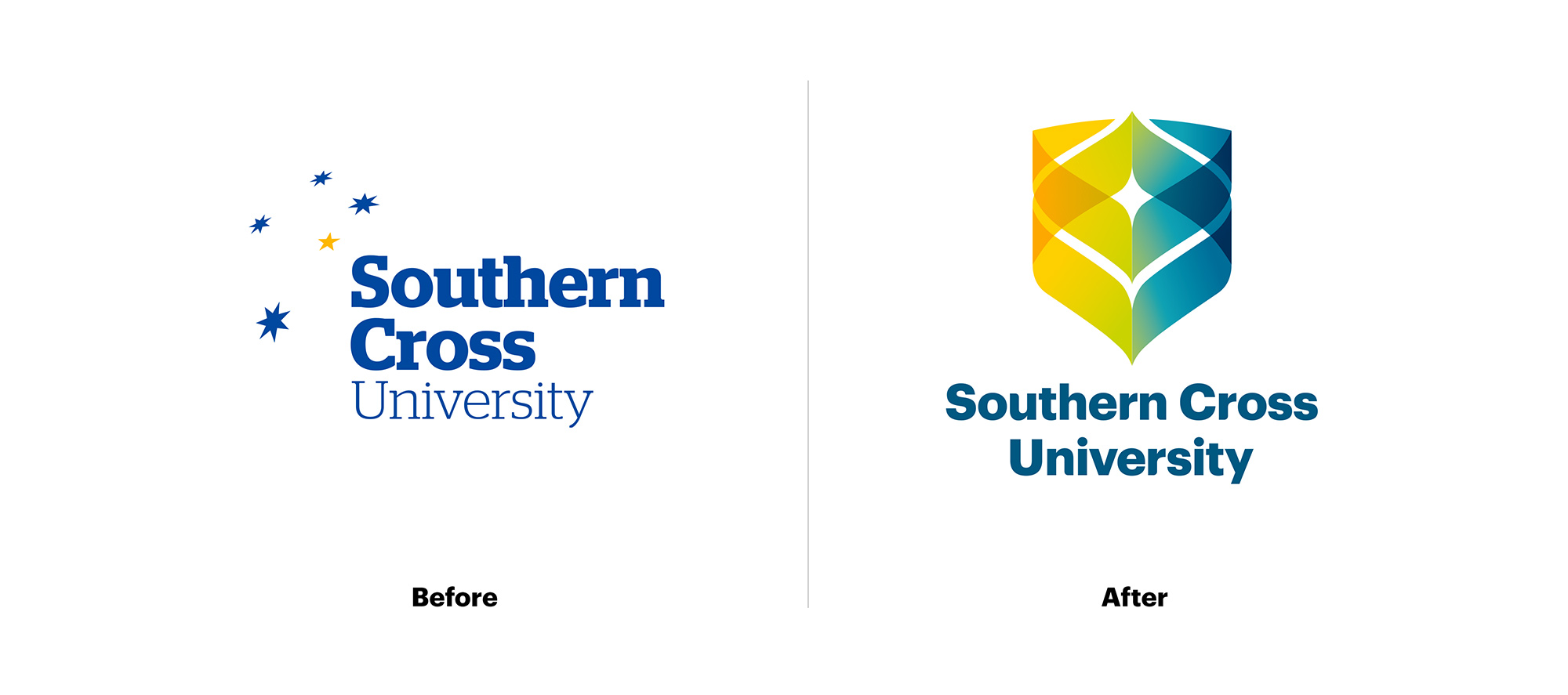
Southern Cross University, an esteemed Australian institution, boasts three primary campuses located at Lismore, Coffs Harbour, and Gold Coast. It has achieved recognition as one of the Asia-Pacific’s Top 100 Universities.
The university sought a revamped logo identity. The task at hand was to provide a contemporary interpretation of the Southern Cross, a widely recognised symbol throughout Australia, aligning it with the university’s progressive positioning. Additionally, the previous Southern Cross constellation logo posed challenges in terms of distinctiveness and digital reproduction.
Solution
Upon familiarising ourselves with the students, the university culture, and the visionary new Vice Chancellor, we devised a solution to encapsulate the university’s dynamic new strategic direction.
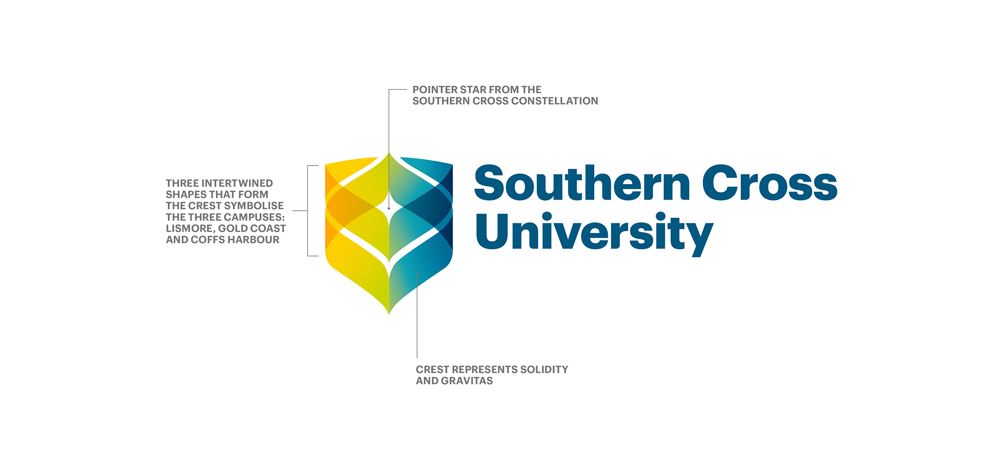
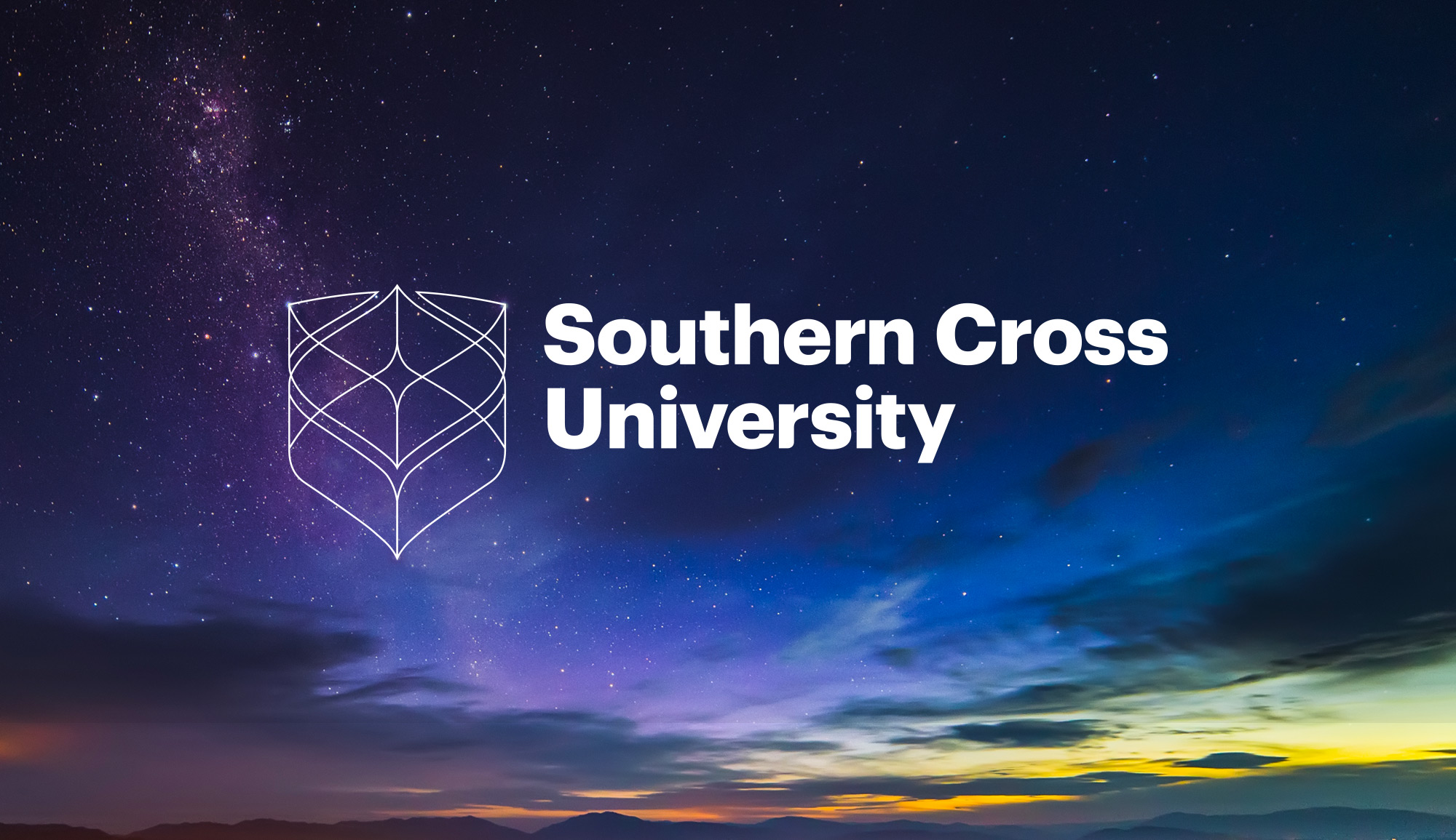
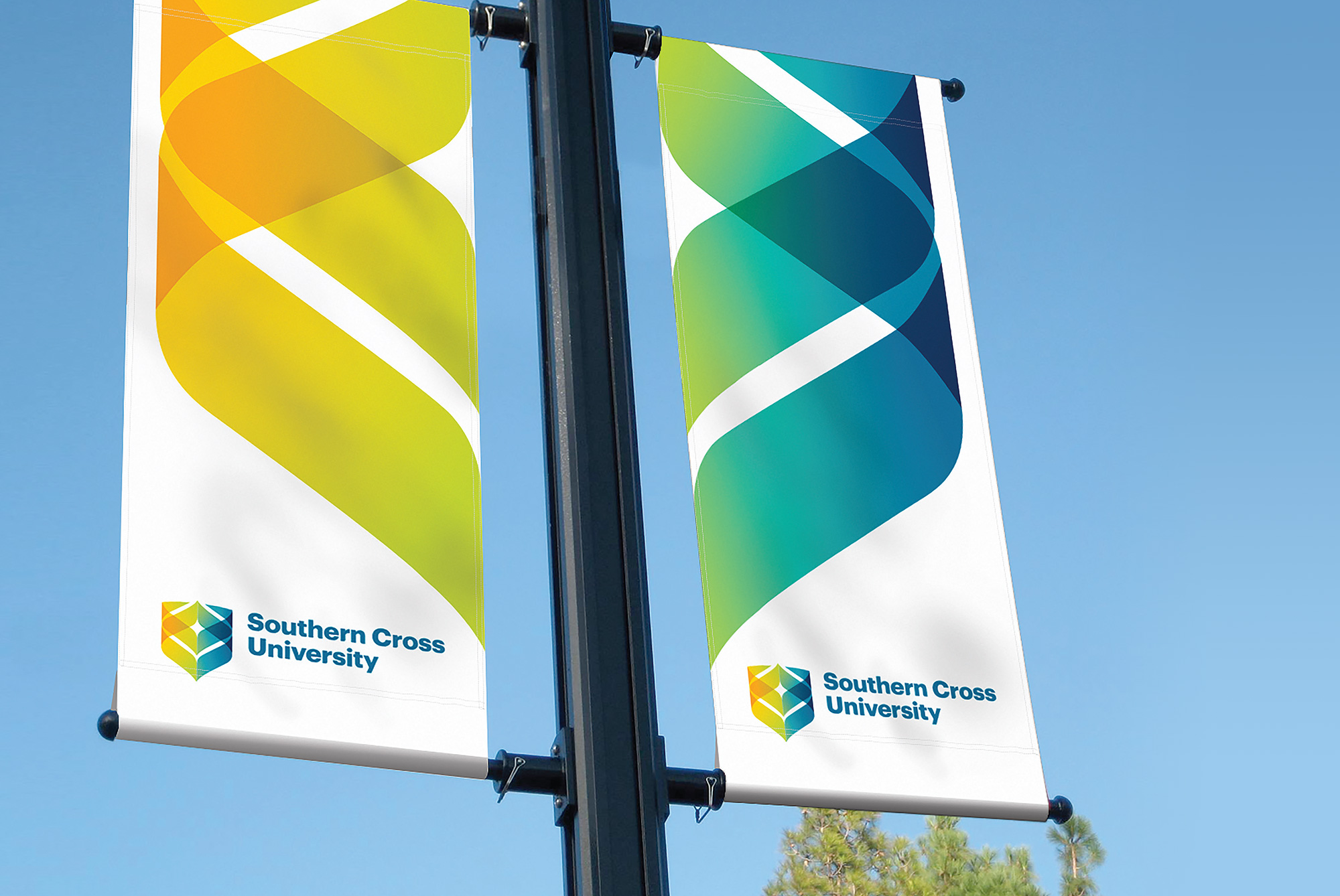
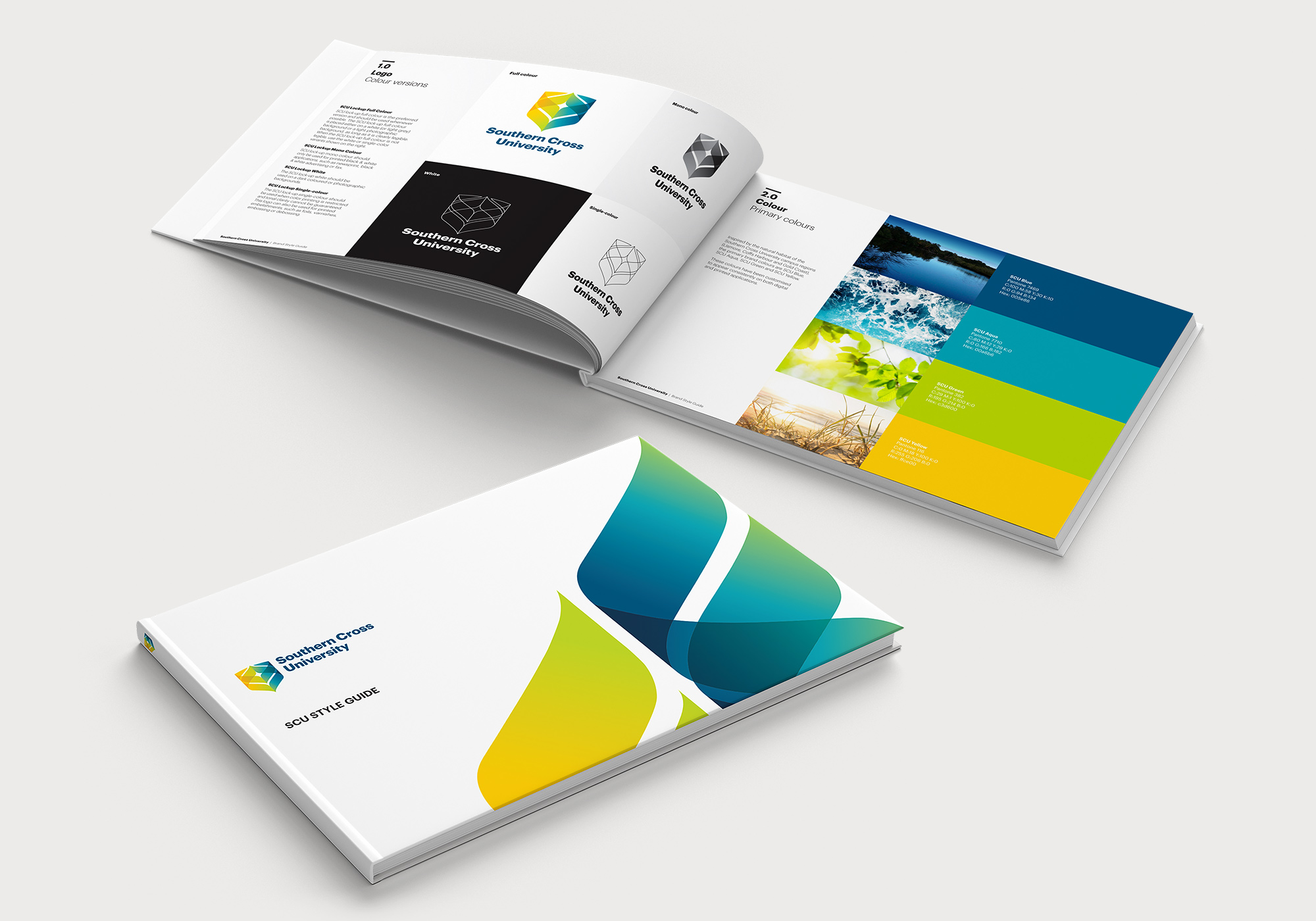
The Star and Shield Symbol
The use of the shield gives the University solidity and gravitas while the intertwined shapes represent the three campuses. The negative space in the middle of the shield symbolises the ‘pointer’ star in the Southern Cross constellation. In the key line version, the shape of the full constellation is uniquely visible.
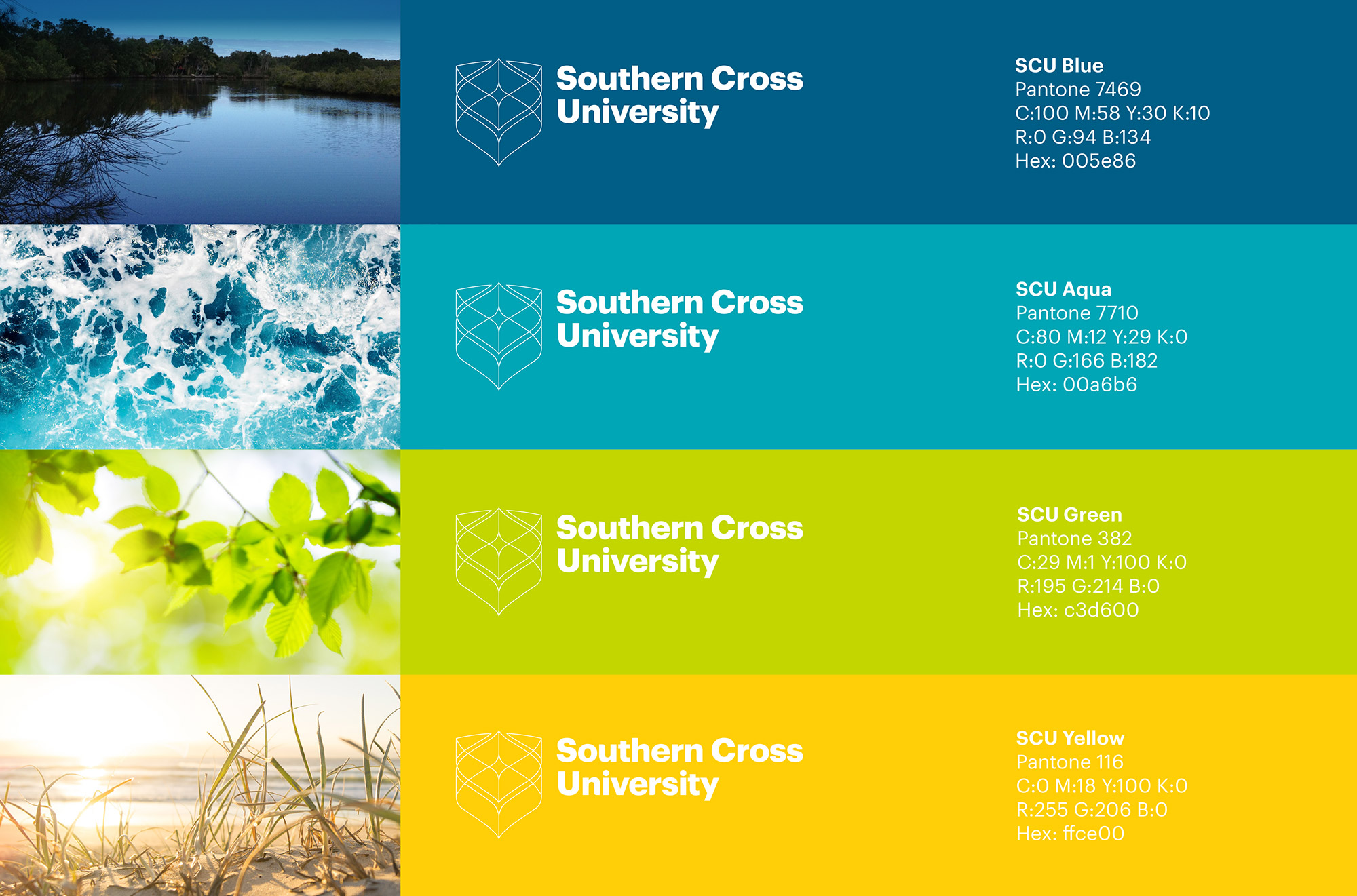
Colours
While the gold and blue colours were retained from the old brand (but updated to reflect the natural landscape of the campus regions), an aqua and green tone were also chosen to emphasise the University’s deep commitment to biological, marine and environmental research and teaching.
Result
Launched at an “All Staffer” meeting, the identity received applause and support of the caucus and has received much positive feedback from staff, students and the general public. The university has proudly rebranded its’ campuses and marketing collateral.


Award
The new Southern Cross University Identity won a Silver in the International Graphis Awards for branding.